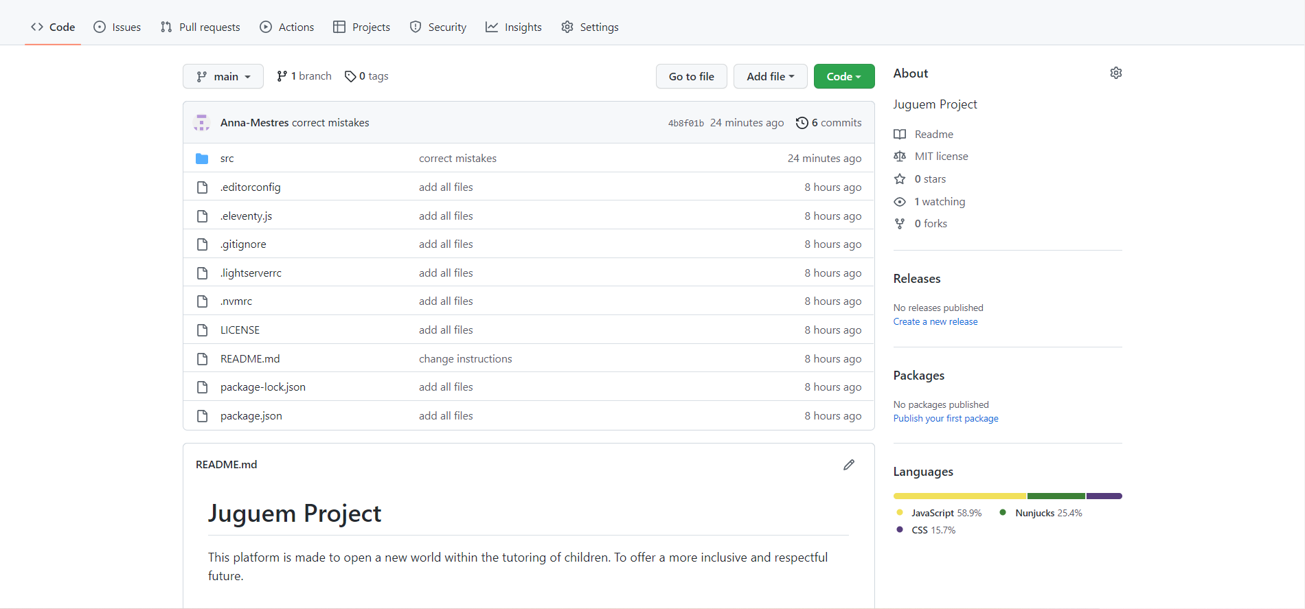
The first design of the Juguem website was made from scratch using html and css only. And it was uploaded to the git hub, this is the link: https://anna-mestres.github.io/JuguemProject/portada.html. But we tried to create a form with php and javascript validation. It didn't work. I had to ask for help to find out what was the problem. And it turns out that the GitHub server does not accept the submit attribute of the form. So it was just a graphic with no use or function. And what's more, everything I had worked on didn't work as such, since my purpose was to make people participate in it.
What I did was to search the internet and I realised that I had a domestika template with nunjucks and janson where the server is Netlify. That tolerates and manages the forms for free. So I had to redesign the whole site again. You have to take into account that I have never designed a website until this year, as well as, that in this case it is the first time I use nunjucks, eleventy, janson and JavaScript. So the process was totally trial and error learning.
Start Building Code
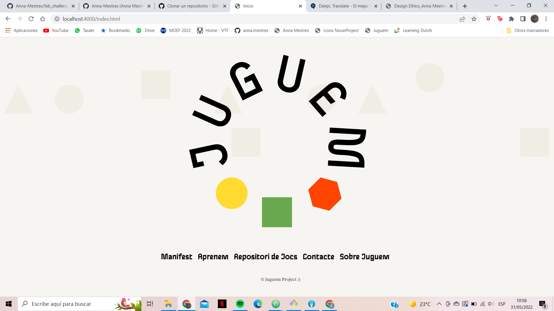
First I started by designing the home page. Where I implemented a JavaScript code so that when the mouse hovered over the central logo image, it would change to the explanation, subtitle. The HTML and JavaScript code we used is as follows;
html code
< div class="col-12 indeximages">
< a href="#" onmouseover="rollover('index', image02)"
onmouseout="rollover('index', image01)">
< img src="../../assets/images/logo.svg" name="index">
< / a>
< / div>
Javascript code
image01= new Image()
image01.src="../../assets/images/logo.svg"
image02= new Image()
image02.src="../../assets/images/explicacio.svg"
function rollover(imagename, newsrc){
document.images[imagename].src=newsrc.src
}
Then with Josep's help I was able to implement a p5js code as a background to make it even more interactive. We had a problem with the z-index layers of the website. Each section of the header, body and footer had a different background colour style implemented. Therefore if we put z-index -1 it stayed underneath and did not let us observe the graphics. So what I did was simply to remove the background of all the contents of the home page. And for that I had to create another header, body and footer, changing the style of these without affecting the other pages. By using nunjucks, I created a header, body and footer with the same content (in the case of body, it collects the content written on each page), thus copiling an index.html for each one with the same structure but different content for body. This was the javascript code made from p5js.
Javascript code
let locationY = -100;
let speedY = 2;
let gravity = 0.2;
function windowsResized() {
resizeCanvas(windowWidth-10, windowHeight-10);
}
function setup() {
canvas=createCanvas(windowWidth-2, windowHeight-2);
//canvas=createCanvas(400, 400);
canvas.position(0,0);
canvas.style('z-index', '-1');
}
function draw() {
background(246, 245, 242);
fill(240, 237, 228);
noStroke();
translate(width/8, locationY);
triangle(-100, 120, -180, 120, -140, 40);
ellipse(0, 80, 80, 80);
square(200, 0, 80, 0);
square(450, 160, 80, 0);
triangle(400, 120, 480, 120, 440, 40);
ellipse(700, 80, 80, 80);
triangle(800, 120, 880, 120, 840, 40);
ellipse(1000, 20, 80, 80);
square(1250, 160, 80, 0);
locationY += speedY;
speedY += gravity;
if ((locationY >= height)) {
speedY = speedY * -0.9;
locationY = height;
}
}
function mousePressed(){
locationY = -100;
speedY = 0;
gravity = 0.2;
}

Thanks to the Domestika course I was able to make the navigation code.
html & nunjucks code
{% set navPages = collections.all | eleventyNavigation %}
< div class="nav-index font-1 col-12 indexnavegacio">
{%- for elemento in navPages %}
< a href="{{ elemento.url | url }}"
{% if elemento.url == page.url %} class="active"{% endif %}
>
{{ elemento.title }}
< / a>
{%- endfor %}
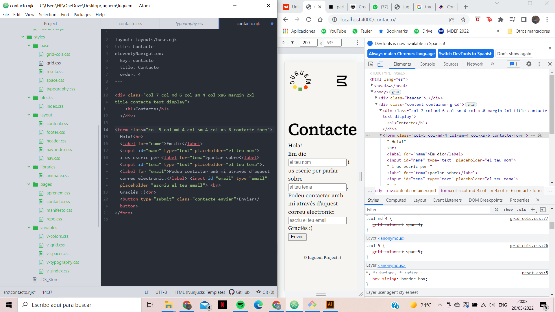
Then create the form for the contact page. Where I implement a form that we know that at the end so that netlify can activate the form we have to implement a couple more classes so that it can process it as such.

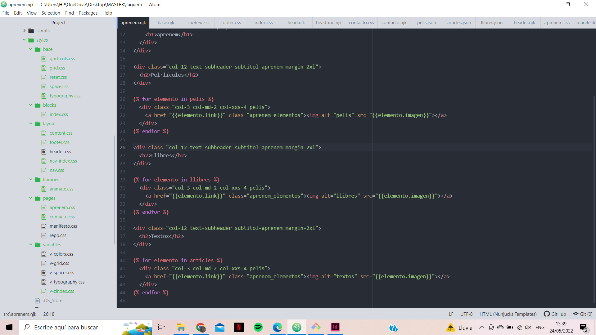
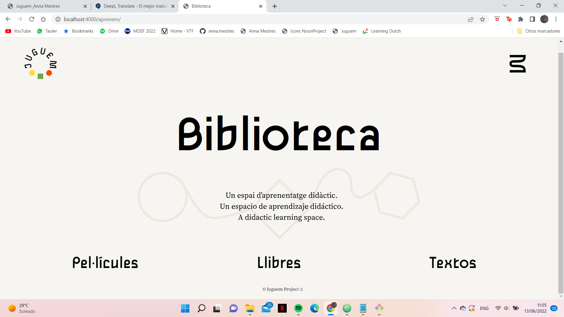
Then I started to experiment with the aprenem code. Where I had to create a library with books, movies and text. From nunjucks I created the loop where in each one I read a database and repeated the same class in each one. First I put them all continuous to check that they worked. When I realised that if the library was too full it would not be possible to visualise correctly all the content, since it would have to go through all the movies to get to the books, and all the documents to get to the texts. So I wanted to create a menu bar with all three, so that the user could choose between the three sections and in this way create a more intuitive and orderly environment.

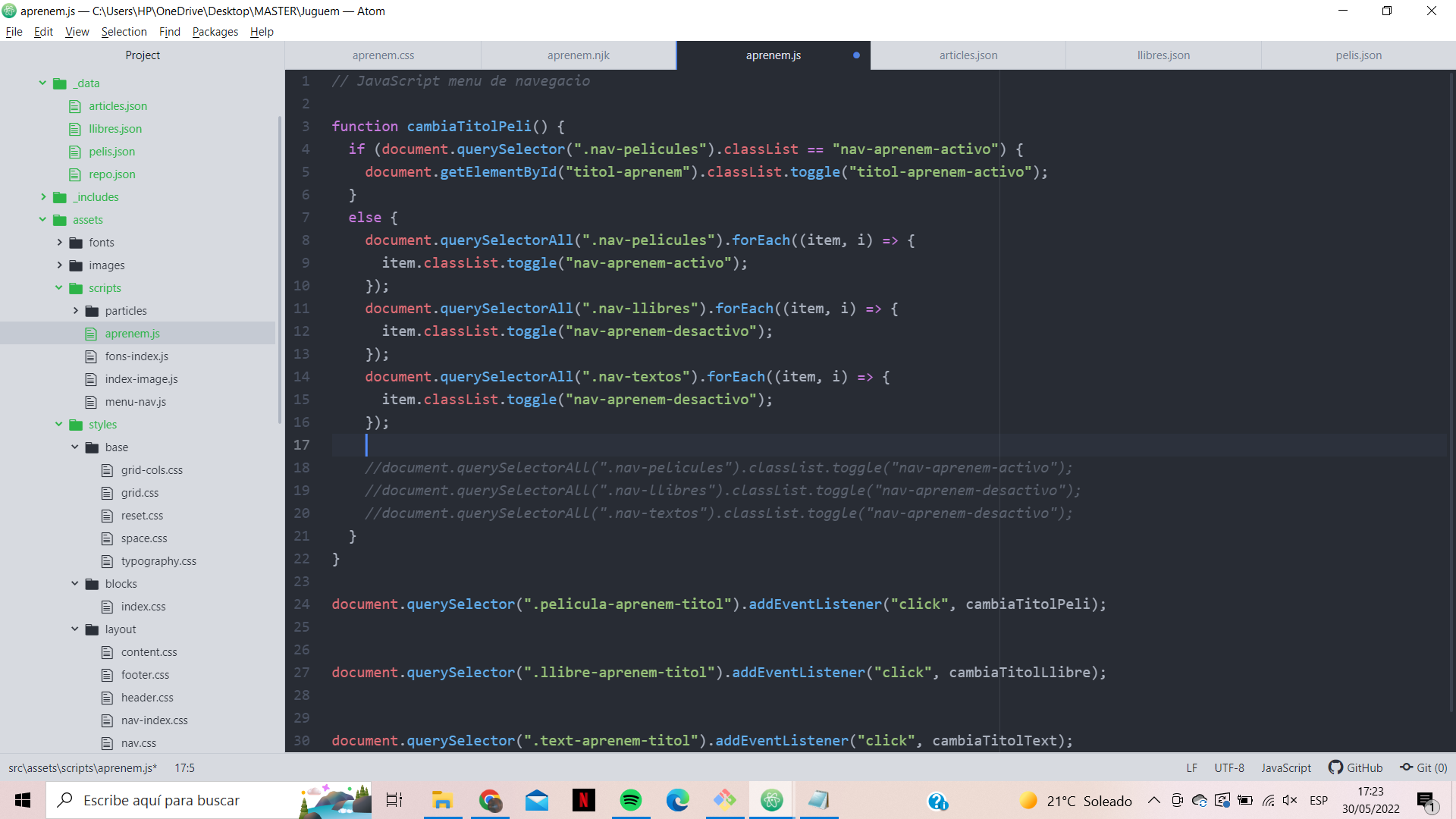
In order to achieve this, I created three buttons and with JavaScript I gave a value to the click that added one class or another to the elements. To explain it in another way. Each group of films, books and texts, I applied from the beginning a display none. This allows not to display or affect the space on the web page. In this way at the beginning we have no element shown because they are all hidden. When clicking on some of the titles, let's say movies, it changes from display none to display block. Displayed and occupying the space on the page. And at the same time it adds display none to the other components, to make sure that if any of them are left open they are hidden again. With the help of Edu from FabAcademy I was able to write the code.

At first, the code seemed to work, but after a while I saw an error. When you clicked on books for example, if you didn't click on books again, it would turn books on again. So looking at the inspector we found out that it was because both classes were applied at the same time. So we added a remove to remove the previous class, if there was one. This would be the final code.
JavaScript code
function cambiaTitolPeli() {
document.querySelectorAll(".nav-pelicules").forEach((item, i) => {
item.classList.add("nav-aprenem-activo");
item.classList.remove("nav-aprenem-desactivo");
});
document.querySelectorAll(".nav-llibres").forEach((item, i) => {
item.classList.add("nav-aprenem-desactivo");
item.classList.remove("nav-aprenem-activo");
});
document.querySelectorAll(".nav-textos").forEach((item, i) => {
item.classList.add("nav-aprenem-desactivo");
item.classList.remove("nav-aprenem-activo");
});
//document.querySelectorAll(".nav-pelicules").classList.toggle("nav-aprenem-activo");
//document.querySelectorAll(".nav-llibres").classList.toggle("nav-aprenem-desactivo");
//document.querySelectorAll(".nav-textos").classList.toggle("nav-aprenem-desactivo");
}
function cambiaTitolLlibre() {
document.querySelectorAll(".nav-pelicules").forEach((item, i) => {
item.classList.add("nav-aprenem-desactivo");
item.classList.remove("nav-aprenem-activo");
});
document.querySelectorAll(".nav-llibres").forEach((item, i) => {
item.classList.add("nav-aprenem-activo");
item.classList.remove("nav-aprenem-desactivo");
});
document.querySelectorAll(".nav-textos").forEach((item, i) => {
item.classList.add("nav-aprenem-desactivo");
item.classList.remove("nav-aprenem-activo");
});
//document.querySelectorAll(".nav-pelicules").classList.toggle("nav-aprenem-activo");
//document.querySelectorAll(".nav-llibres").classList.toggle("nav-aprenem-desactivo");
//document.querySelectorAll(".nav-textos").classList.toggle("nav-aprenem-desactivo");
}
function cambiaTitolText() {
document.querySelectorAll(".nav-pelicules").forEach((item, i) => {
item.classList.add("nav-aprenem-desactivo");
item.classList.remove("nav-aprenem-activo");
});
document.querySelectorAll(".nav-llibres").forEach((item, i) => {
item.classList.add("nav-aprenem-desactivo");
item.classList.remove("nav-aprenem-activo");
});
document.querySelectorAll(".nav-textos").forEach((item, i) => {
item.classList.add("nav-aprenem-activo");
item.classList.remove("nav-aprenem-desactivo");
});
//document.querySelectorAll(".nav-pelicules").classList.toggle("nav-aprenem-activo");
//document.querySelectorAll(".nav-llibres").classList.toggle("nav-aprenem-desactivo");
//document.querySelectorAll(".nav-textos").classList.toggle("nav-aprenem-desactivo");
}
document.querySelector(".pelicula-aprenem-titol").addEventListener("click", cambiaTitolPeli);
document.querySelector(".llibre-aprenem-titol").addEventListener("click", cambiaTitolLlibre);
document.querySelector(".text-aprenem-titol").addEventListener("click", cambiaTitolText);
Once it was finished, we needed to create a form to be able to send new ideas to increase the library among all of us. That's why I created a separate form for collaboration and let you choose to add films, books and texts. And thanks to Ximena's comment I added the section on reasoning, because sometimes perspectives can change.
Finally I designed the two most complicated and essential parts of the website. One for its semantic value, the manifest, and the other for its utility, the game repository. First I chose to design the manifesto. I wanted to give a clear and effective order if in any case someone didn't want to read it in its entirety to have a perspective of the situation. From here to the initial explanation and introduction. The purpose and objective of the website. And the main ideas before starting the text. And finally, the game designed in intervention 4, to provide new points of view.
We wanted to make it a bit more visual to make it more pleasant to the public, and not another political text with only semantic value. So this illustration was animated from an open library called vivus written in JavaScript language.

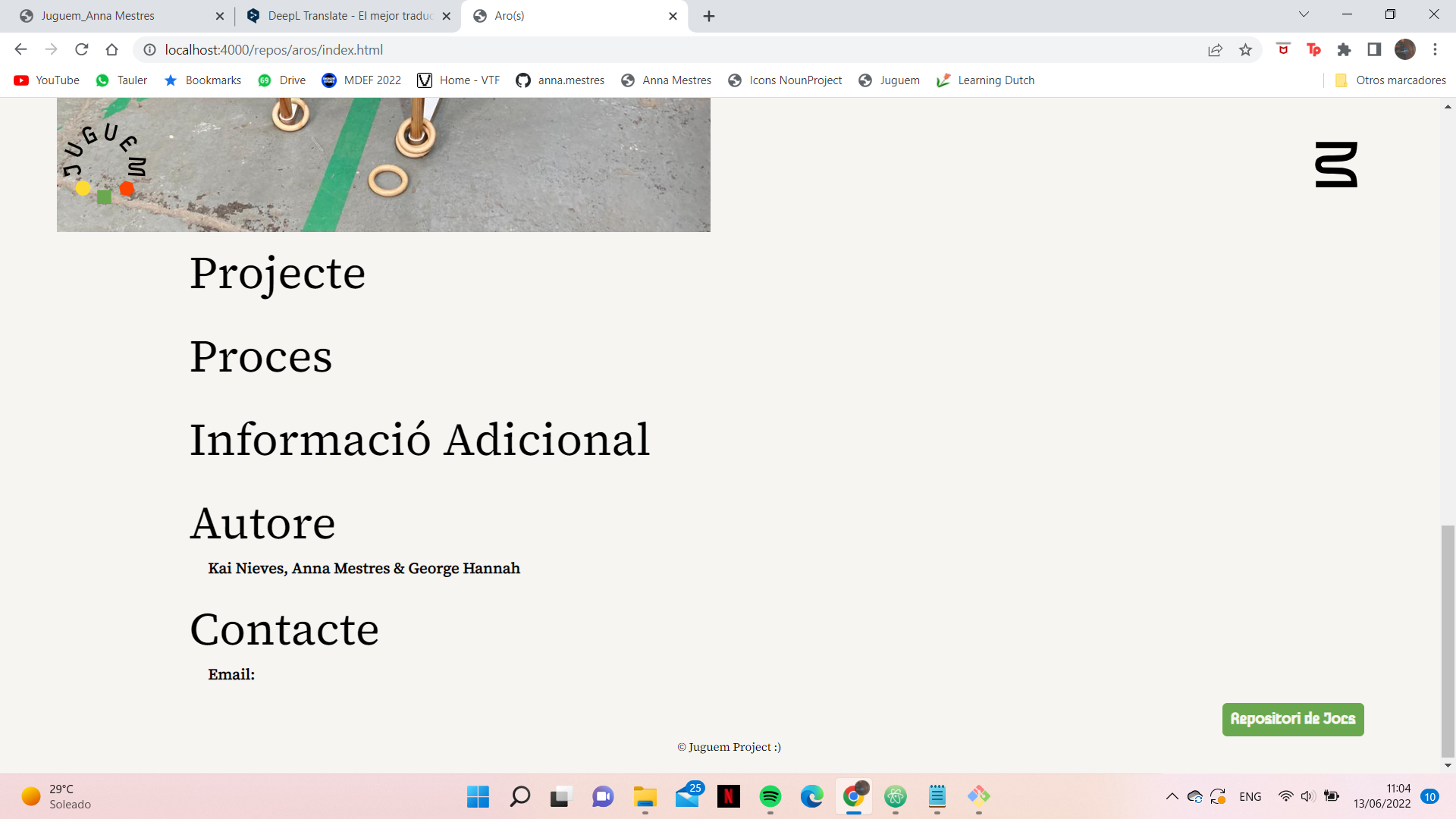
During this creation process I realised that the name of the aprenem section did not make much sense as it was more in line with the definition of a library than with anything else. Also thinking towards the inclusivity and dynamism of the page, it makes more sense to give it a common name and to know what is expected when clicking on it.

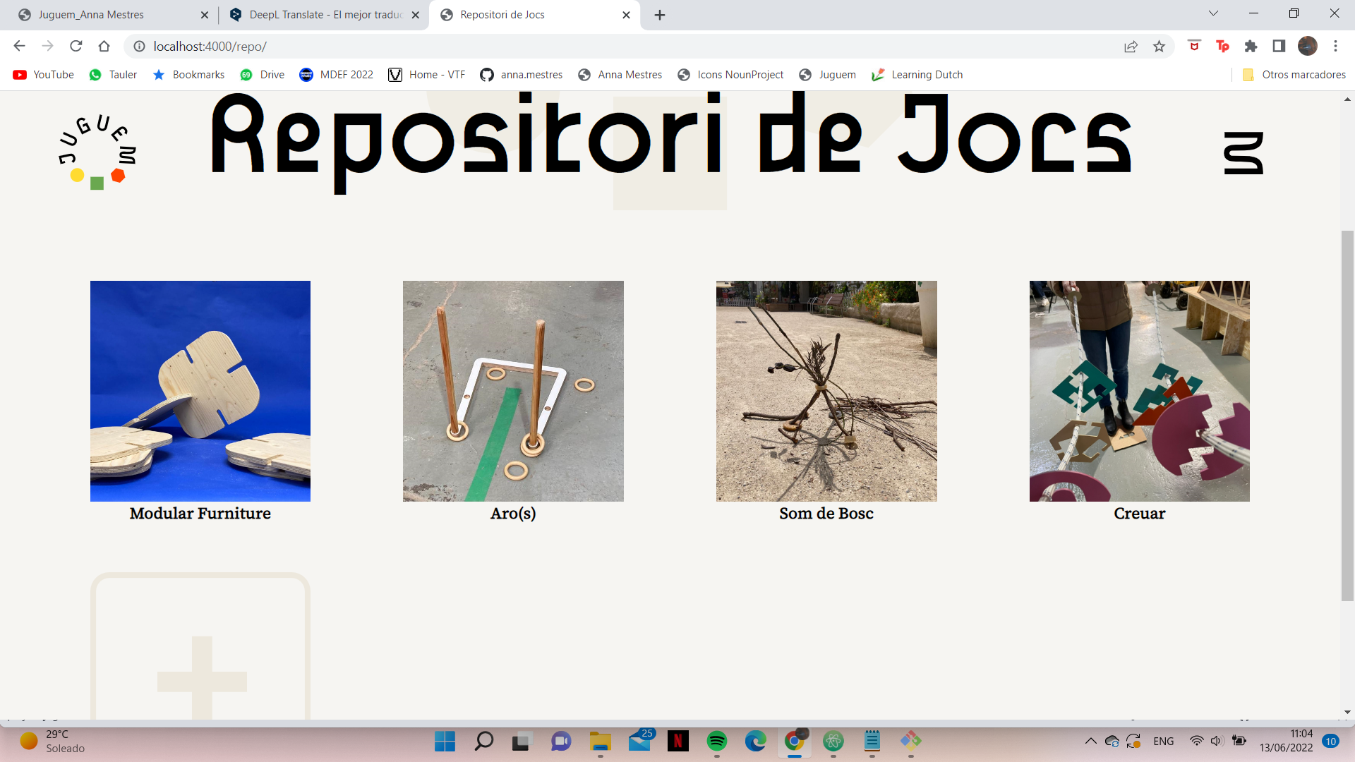
For the repository we took the same loop as for aprenem, but now it's a library. And the styles were modified so that they were more appropriate to the page. Then I created a page for each game with the same structure. I realised that when you were on the page there was no way to go back if you wanted to go to the repository again. So I put a button to go to the repository directly.


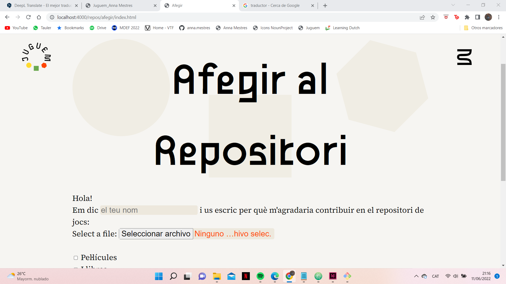
Finally I created another document to explain what was needed to contribute new games to the site. First I thought about creating a form like the others, but in this case I needed pictures to be sent to me. And if you can upload files directly from the pc in a form, but then it could be that the images would be too heavy and could not be sent. This way by doing more steps I also create a filter for people who really want to participate in the project. So it's just a guide with the documents needed and the mail to send.

And with this we would have all the sections of the whole website for the moment. We know that as it is a web page we will have to keep revising and adding what people send us.
The Manifesto
As I have already explained, the website is written in Catalan, so the manifesto is in Catalan. But this is the intrinsic process I have done to be able to write it. And finally you can read it in full in English.
First I outlined the main ideas I wanted to focus the project on and also the main objective. In order to be able to focus the manifesto correctly.
Purpose:
Creating new prespectives between generations by the aid of alternative toys, for the exploration of the family structure and invisible realities.
The main ideals we pursue with this platform are:
- Bring new opportunities to the new generations.
- Break with family roles and perfect relationships, such as gender, sex or sexuality.
- Argument and comment on new ideas of self-knowledge and management.
- Provide safe space for new generations, especially in the early stages of life.
- Respect and fairness, among all species on the planet
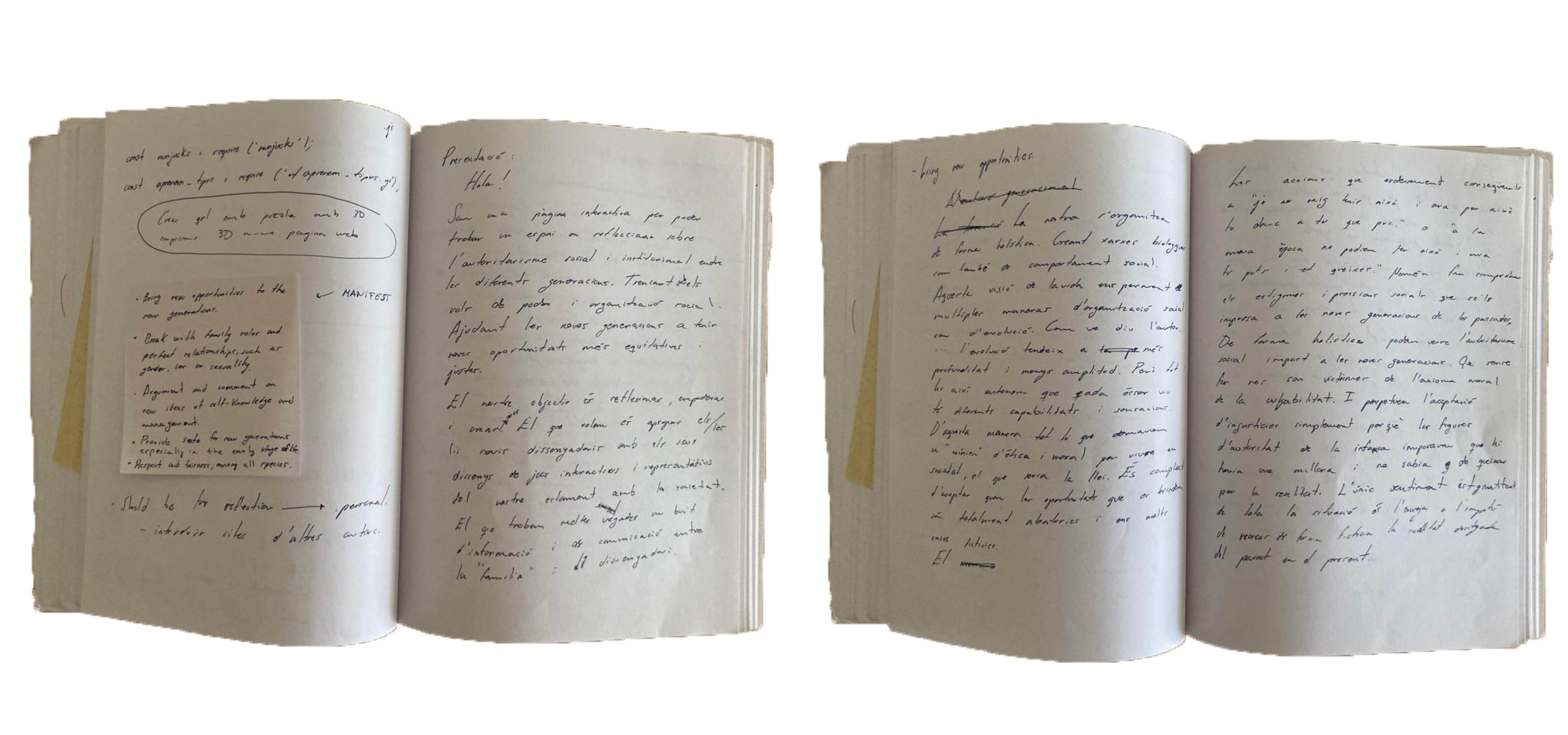
I then set about writing clippings in my notebook between my trips to Barcelona with the train, or my moments of relaxation to clear my head a little. In order to find the thread of the story and what I really wanted to expose.

Manifest
When we try to analyse social behaviour or at least its organisation, we can understand that it is part of the whole historical evolution of each culture and society. That in a holistic way it is organised by creating biological and social networks. That, consequently, the holarchy as a political form of interactions takes place. But we understand that this does not only depend on the biological character but is a combination of this and the contemporary socio-cultural and political character of the time. As the philosopher Ken Wilber says in A Brief History of All Things, evolution tends towards more depth and less breadth.
In many cases we still hope to change the world in which we live to make it more equal and freer. Main ideals of the political left. Which in many cases, fall back on the fallacy that the world can be changed alone. But the ideas and our movement are based on millions of thoughts and movements that came before us and are contemporary to us. Hence the holistic form of generations and social organisations. Which consequently does not depend only on one single being.
An interesting aspect that Alberto Alberti explains in the text El autoritarismo en la sociedad actual: el niño hasta los seis años is the neo-capitalist myth of efficiency and rationalisation. The false mobilisation of the class society grants an improvement in the acquisition of well-being by some individuals of a higher technical level of origin, and thus provokes the search for personal exigency, for the dynamism of acquiring such an improvement. And this false movement finally gives hope, in the form of social pressure, to children and new generations. Or at least one more reason to contribute to the dynamism of the neo-capitalist myth, to open doors for the new generations. Doors which, therefore, only exist in a contradictory way. We remember the saying that when a door closes, a window opens. There will always be an aspect of social improvement and, therefore, of hope for a better future. That indirectly causes the individualisation of the self and the family as a social organisation of importance as a retribution for the actions contributed.
And this aspect brings us to two sides of the coin, the arbitrariness of social violence and the character of labour as a political organisation. Both as retaliation by the new generations. Institutional class-based violence. As well as the interpretation of the state within the family organisation, as Foucault says. We know that the relationship between gender, sex and sexuality begins in the early stages of childhood, and the relationship between these three concepts and the child is political in nature. This in many cases is interpreted intrinsically from micro-actions represented by society. They endow the child with machismo, racism and homophobia among others.
Our personal development begins in childhood, and it is in childhood that everything is discovered for the first time. As Plato, Aristotle and Schopenhauer put it in different words, the origin of philosophy comes from surprise. And this is where the metaphysics of each person begins to be created during childhood and the surprise of a new world to discover. Precisely all the actions that may occur in this case will have repercussions on the psyche of the child and in the future of the adult. But we make it clear that it is impossible to protect the child from the world and from death. And this is a recurrent theme, where for example the authors Ada Della Torre and Susan Isaacs, among others, have worked on this aspect.
It is interesting to give the connotation of Hannah Arendt's meaning of social responsibility. Where responsibility constitutes the political concept that implies taking charge of the world, assuming the historical inscription in the same world and the possibility of understanding the actions in which one lives. And this is where the question arises: what is the real social responsibility of families for children? Many studies on children's rights have been and are being developed. And every society creates its own regulations on the minimum care of parents/guardians for the children in their care. As well as moral and ethical regulations are created, without legislation in force in the rule of law, but with an affective character in the psyche of the child's evolution. And this aspect of the belief in the need for a family is a fallacy, what is needed is a socio-affective environment of mutual respect.
It is social to associate play with children, even though we all play every day. Because play is the tool that traps us and unveils a parallel world between our inner desires and the real world we observe and live in. As we have already specified, what for adults is endowed with a real world, for children is a new world to discover and learn. This does not prevent adults from continuing to learn and be surprised by the world. They bring out the innocence of their own child. And the fact is that with games we can break the links between generations and relate concepts that we would not be able to do on our own. It is a tool for expression and communication. It is also a tool for learning and connection. Therefore, in this space we defend the time of creation and of understanding oneself with new ways of playing and learning.
We know that thinking hurts. That it shatters integrity within the fantasy world that has been created. But we need to think to be able to coexist, understand and esteem without toxicity. We need to think to evolve. We question social relations and organisations, like the artefacts that bind us together and create parallel worlds.

